
SYSTEMS
AI
ENGINEERING
Design Systems in the Age of Agentic AI
Systems are the new product
raffic is down. Impressions are flat. The content hasn't changed. What did? The way people search. AI-powered answer engines — Perplexity, ChatGPT Search, Google's AI Overviews — don't browse your website the way a human does. They read its structure. They parse its labels. They follow the logic of how information is organised and connected. If that logic is unclear, your content doesn't get surfaced. It gets skipped.This isn't a new problem in new clothes. It's the same problem design teams have always faced — incoherence at the foundation — now with higher stakes and faster consequences.
What machines actually read
When an answer engine crawls a page, it's not admiring the typography. It's reading the DOM. It's parsing class names, heading hierarchies, semantic HTML, token relationships and schema markup. One question: can I trust this structure enough to surface it as an answer?
Most sites fail that test — not because the content is poor, but because nobody held the line on consistency. The design system drifted. Class naming conventions broke down. New components got built without reference to existing ones. The result is a codebase that reads like four different people's handwriting on the same page.
A human visitor might not notice. An answer engine moves on.
BEM — Block, Element, Modifier — is one of the cleaner fixes here. .card, .card__title, .card--featured. Predictable. Parseable. A crawler reading .card__title knows exactly where it is in the hierarchy. Compare that to a codebase where the same element appears as .title, .card-title, .CardTitle and .txt-lg-bold depending on who built it and when. Each one renders identically in the browser. None of them tell a machine anything useful.
Consistency here isn't pedantry. It's commercial. Invisible content doesn't convert.
If content was king, context is King Kong
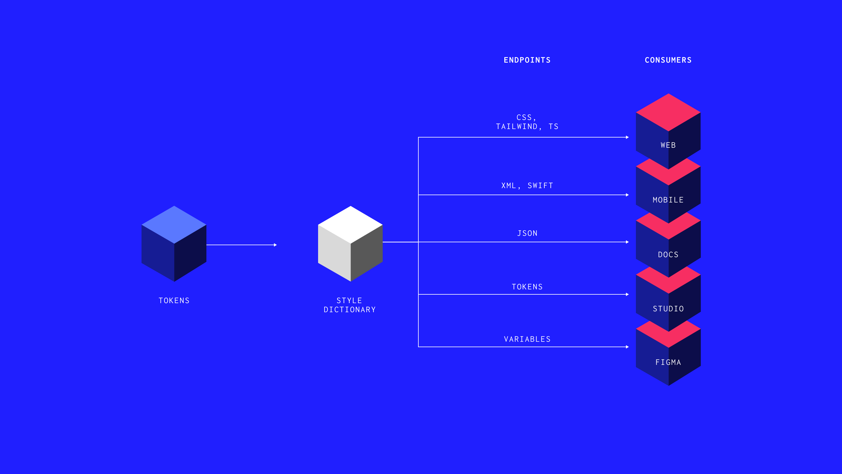
The Figma MCP, Webflow's MCP, the forthcoming Storybook integration — these tools share one principle. They give AI agents structured context in a format a model can parse and act on. Not a long prompt. Not a wall of documentation. A defined schema that maps directly to your design decisions.
Figma's MCP pulls metadata directly from nodes within your design file — component names, constraints, style relationships — and hands that to an agentic coding tool like Cursor or Claude Code. The result is generated code that understands what it's supposed to look like, not just what it's supposed to do. The canvas and the browser, connected. Louis Ouriach at Figma describes it well: the goal is to go from canvas to browser, feel it, and go back — that feedback loop for a non-technical designer opens doors that were previously closed by process, not ability.
Webflow's MCP goes further: live access to your site's page structure, CMS collections and style tokens in a single context. One prompt. One environment. No handoff document.
This mirrors what AEO demands of your website. Structured data. Semantic HTML. Clear relationships between content entities. Schema markup that tells an answer engine what the content covers, who produced it and why it's relevant.
Coherent design system → coherent HTML → coherent structured data → answers. That's the chain. Break any link and the content vanishes — not from the web, but from the AI's response.
The system is now the machine's brief
A year ago, plenty of people in the design systems community were quietly panicking. Ouriach puts it plainly: in January 2025 he thought the role was no longer relevant. That feeling didn't last long, because what became clear almost immediately was the opposite. The documentation teams had spent years producing — the guidelines, the rationale, the naming decisions — turned out to be exactly what AI tooling needed to produce reliable output. Not for people anymore. For machines.
The pendulum swung hard. Design systems aren't dead. They're load-bearing.
Here's the shift most teams are still underestimating. A lot of people looked at systems as a team in the corner, raising quality and helping businesses scale. Now the system becomes the centrepiece of all successful engineering work. The more a team relies on a tool to create their code, the more they rely on a system to tell that tool what to code. The less they invest in a system, the more they generate noise — and that noise piles up. Someone will have to fix it.
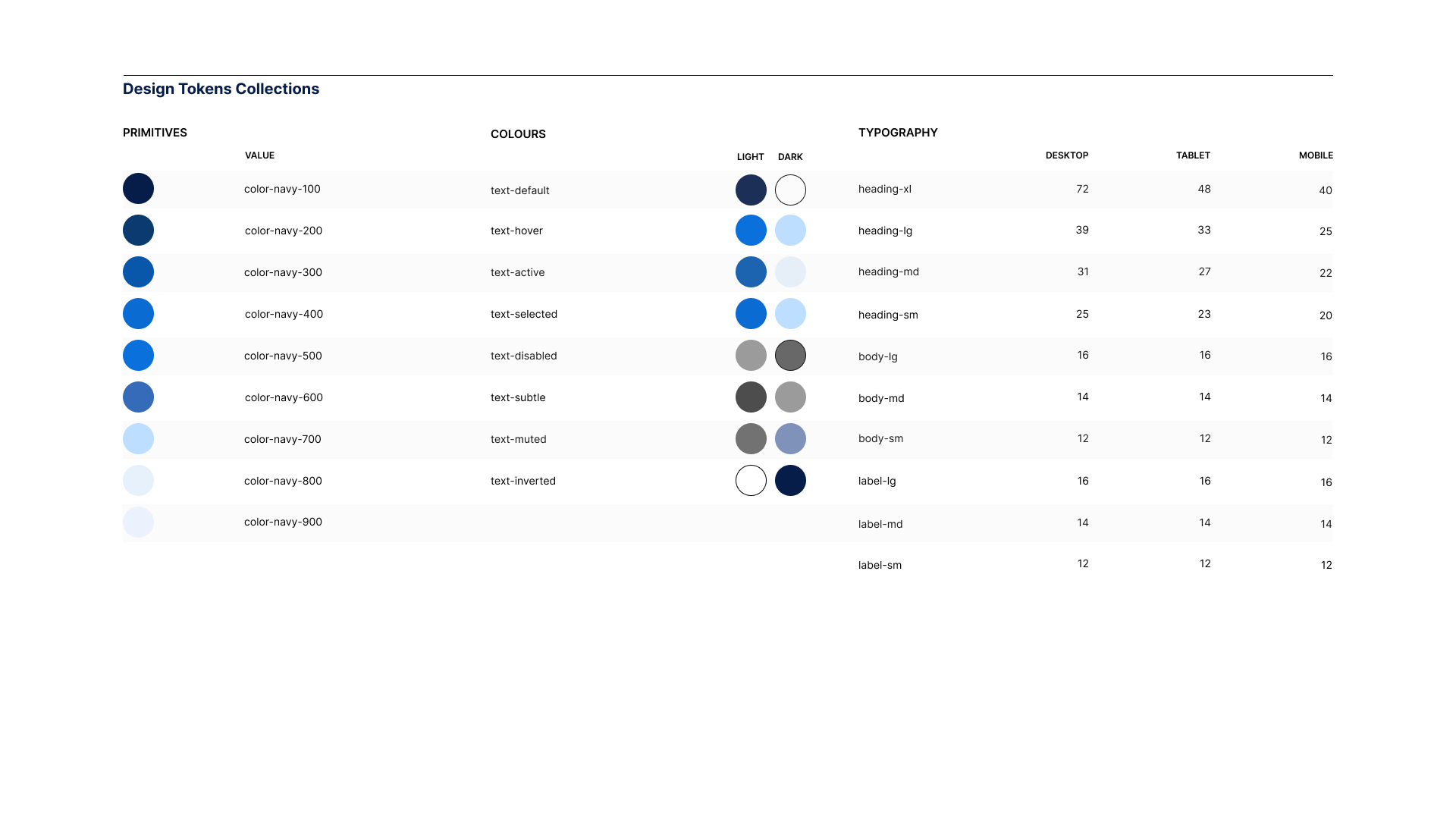
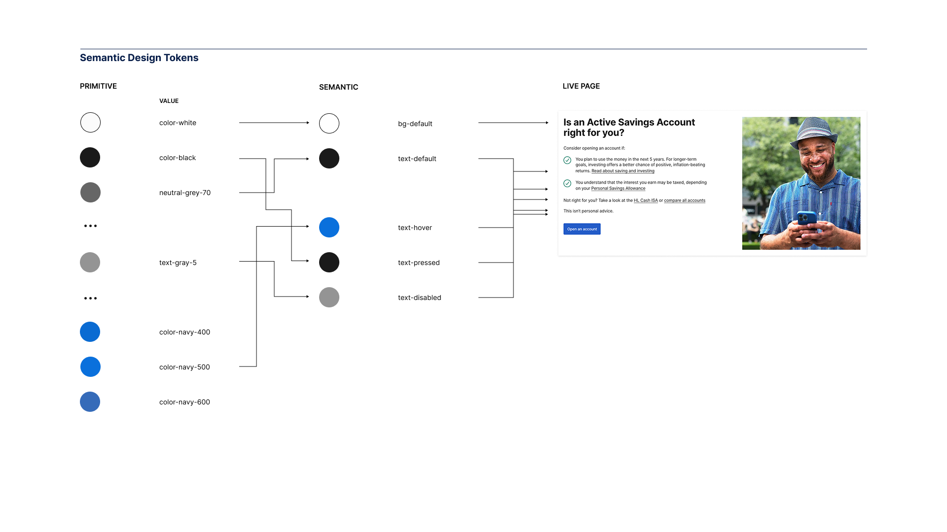
Design tokens — colour, spacing, type scale, motion — are the vocabulary. Semantic tokens map that vocabulary to intent. Component definitions carry the rules. When that architecture is coherent, it becomes machine-readable without effort. An agent that ingests a well-structured system doesn't hallucinate components or invent spacing values. It knows the language and uses it.
A sprawling, undocumented system produces the opposite. Every generation step widens the gap between design intent and delivered output. The tool meant to accelerate, accelerates incoherence instead.
What's worth your attention — and what isn't
There's significant noise in this space. Worth sorting quickly.
Worth watching: MCP integrations already live in tools your team uses. Figma and Webflow are both there. The Storybook MCP — which will let an agent self-heal component errors against your own library — is close. These are structural shifts, not features.
Worth ignoring: the claim that AI generates a design system from scratch. It generates artefacts. It cannot generate the decisions behind them. The value of a design system was never the tokens file or the component library. It was the argument that produced them — the debate, the constraints, the rationale baked into every naming choice. AI accelerates implementation. It doesn't replace the judgement that makes implementation worth anything.
Also worth ignoring: the idea that a strong system matters less as AI tooling matures. The opposite is true. Ouriach makes the point sharply — the less you invest in the system, the more rubbish you generate into your codebase, and it will pile up like a landfill. The more autonomous your delivery pipeline, the more load the system carries.
One reframe that helps: stop calling it a design system. That label drags in budget conversations, hiring debates and questions of specialism. Call it quality infrastructure. A technically curious designer and a design-curious engineer doing good work together produce a system as a byproduct. The label often creates the very silo it was meant to dissolve.
the system becomes the centrepiece of all successful engineering work.
– Luke Ouriach, Figma
Pitfalls worth knowing before you start
These aren't edge cases. They appear in most teams within the first few months of serious AI adoption.
The first is isolation. AI tools let every team member generate work independently, quickly and without discussion. The output looks complete. The brief was never shared. Teams that normalise this produce a collection of individually reasonable decisions that don't add up to a coherent product. As Ouriach notes, a design system is a quality bar — and that's everyone's job, not a siloed team's responsibility. Discussion before generation isn't a slow-down. It's the mechanism.
The second is skipping the why. Auto-generated documentation captures what the code does. It captures nothing about why it does it that way. A future developer — or a future agent — reading only the output inherits no context. Document decisions as they're made. The investment is small. The compounding value is significant.
The third is thin context. Agents are only as accurate as the information they're given. Without a well-structured system and clear component definitions, they default to pattern-matching against training data — which may bear no resemblance to your brand or your architecture. The model's capability matters less than the quality of what it's given to work within. Give an agent a strong system and it performs well. Give it nothing and it invents with confidence.
How I got here
I came to systems thinking the hard way.
In 2004 I broke my back snowboarding. Not a dramatic story — a bad landing, the wrong angle, a moment where the structure gave way under load. What the recovery gave me, slowly, was a way of seeing: an instinct for what holds, what fails under pressure, and what breaks when pushed past tolerance.
That instinct followed me into design. Fifteen years working with teams at the BBC, Nike, LEGO, Microsoft and Red Bull. The same problem, wearing different clothes on every project: talented people losing momentum not from lack of skill but from lack of shared language. Inconsistent foundations. Tools that sprawled. Decisions that weren't documented and so got made again, expensively, by the next person in the chair.
HUX came from that. One idea: a coherent design system is judgement infrastructure. It doesn't just make things look consistent. It encodes the decisions that let a team move without asking permission at every turn.
Where this goes
The shift I feel most clearly right now is one of reach.
As a technically curious designer, I can prototype at a fidelity that used to require a developer and a sprint. Webflow and Claude together mean I can build and test ideas in hours. Figma's MCP means real design data feeds directly into working code. The gap between the idea and the proof has narrowed to almost nothing.
That's not a threat to craft. It's an expansion of it. The judgement — what to build, why this component and not that one, what the system needs to prioritise — still sits with the designer. The tools execute faster. Which means more time for the decisions that actually matter.
Ouriach frames it as not faster, but further. That's the right way to think about it. The canvas matters for ideation and direction. The browser is where you commit. The system is what connects them — and without it, neither the canvas nor the browser produces anything worth keeping.
The direction for HUX follows from this. Helping teams build that connection deliberately: structured play that develops judgement before it demands velocity. Systems that feel light. Delivery that stays coherent as the stack accelerates.
The foundation is the same as it was in 2004. Understand what holds under pressure. Build from there.
Speed without structure creates chaos. A coherent design system is the way out — for your team, your visibility and your next idea.
ARTICLES
FURTHER READING


Hamish Duncan runs HUX, a British design systems practice. He teaches operator-led no-code workshops for teams who need to scale without chaos. Build at the speed of thought.
Winter 2025/26 workshops now open.
hamish@hamishduncan.com
+44 (0)7832 839 543