
SYSTEMS
TOKENS
ENGINEERING
Design Tokens Unpacked
A working token system has three layers. Each one answers a different question.
f your enterprise has twenty-five teams each making their own buttons, it costs you a million dollars to have good buttons. Nathan Curtis drops that number in his workshops and it lands every time — not because it's precise, but because everyone in the room knows it's directionally true. The same decision, made slightly differently, by slightly different people, hundreds of times over.
I've inherited a lot of systems that got here. They all share the same trait: a well-curated colour palette with no opinion about how to use it.
This piece is for designers who use tokens every day — who pick text-default from a Figma variable, apply background-subtle to a card, and move on — but who haven't built the architecture underneath.
The palette isn't the problem
There's a moment on every project where the system stops holding. Someone applies the same blue to a heading and a button hover state. Someone else picks a different grey for body text — close enough that nobody flags it, different enough that the product starts to feel like it was designed by committee.
Most of the time, the palette isn't wrong. The architecture underneath it was never built.
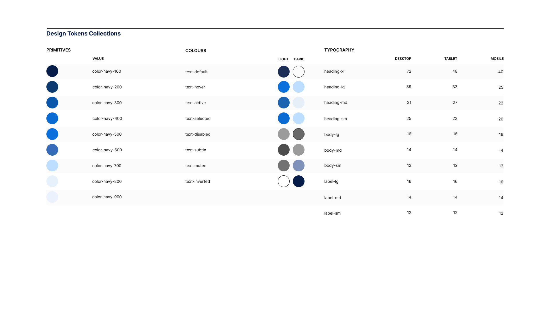
You've got a primary brand colour — a deep blue. You store it as a primitive token:
color-primary-500:#1A3FB5
You build out lighter and darker steps, add neutrals and feedback colours. This is your primitive palette. A curated set of raw values with no opinion about where they should be used.
Most systems stop here. The palette gets dropped into Figma, published to a library, and designers start applying color-primary-500 directly to buttons, headings, and backgrounds. It works — until the brief expands.
In Design Systems, Alla Kholmatova describes what happened when FutureLearn standardised their text sizes into a unified scale. They expected consistency. What they got was ambiguity — designers still didn't know which size to pick. The values were shared. The meaning wasn't.
That's the primitive-only system. When you apply primitives directly to components, every design decision becomes a social agreement — and when the team grows, those agreements break down.
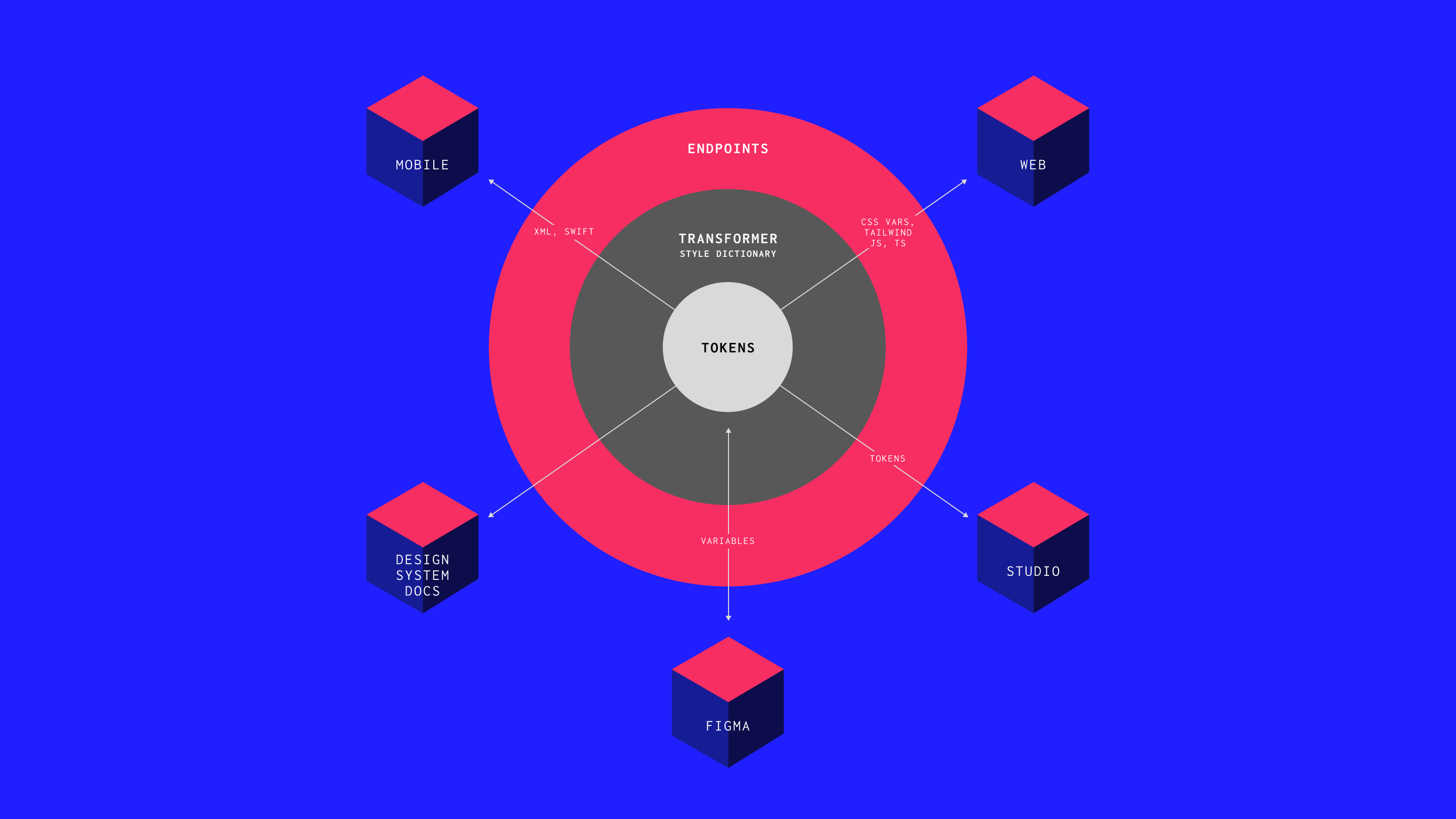
Three layers, not one
A working token system has three layers. Each one answers a different question.
Primitive tokens answer: what values exist? These reduce infinite possibilities to a curated set — thirty to two hundred values, typically. Raw hex codes, pixel values, font stacks. Ingredients without a recipe.
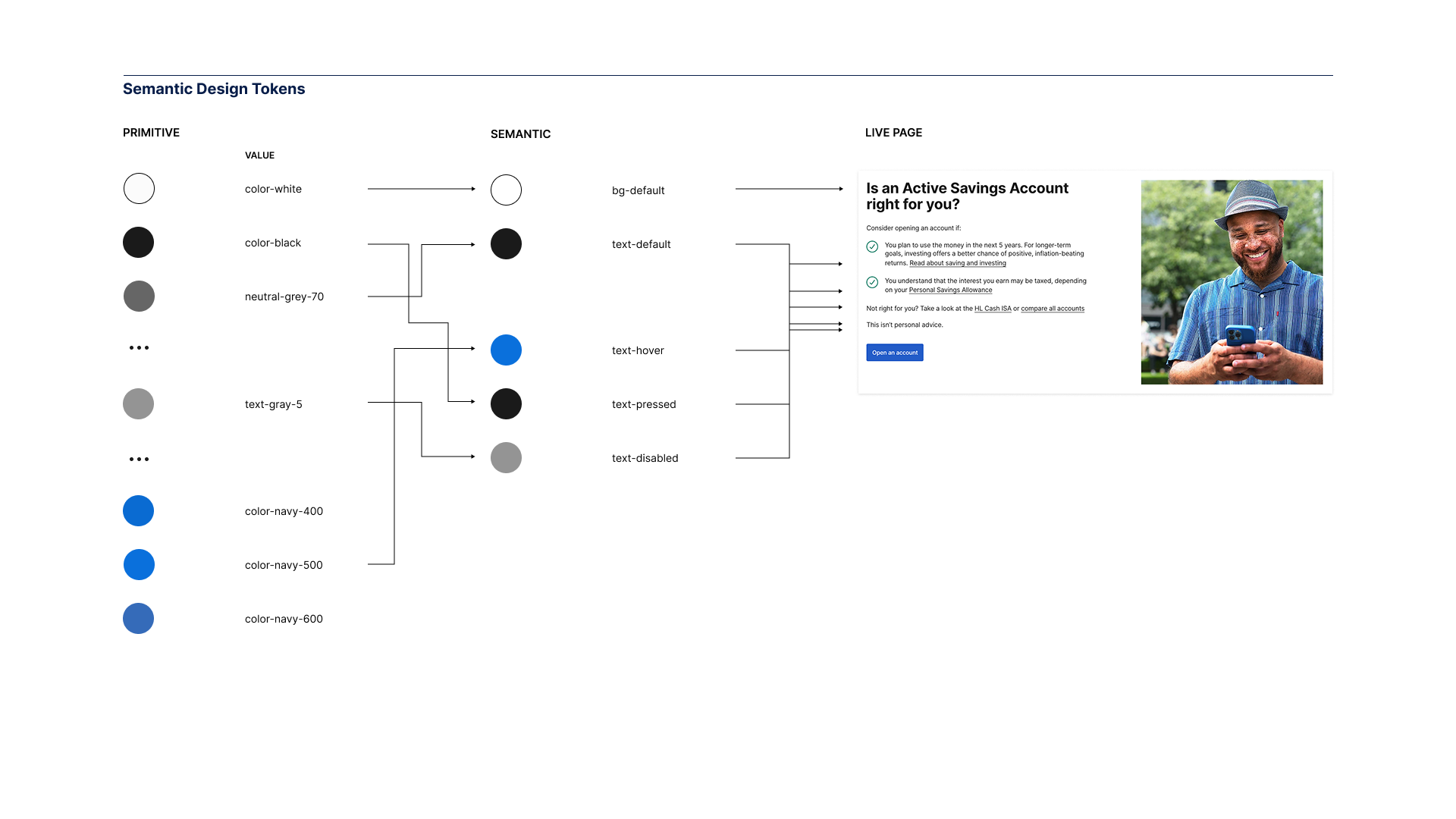
Semantic tokens answer: what do these values mean in context? This is the layer most systems skip. text-default points to neutral-200. background-primary points to primary-500. The name tells you the role and the intent — not the value. When a designer picks text-default, they don't need to know which grey it is. The system has already made that decision.
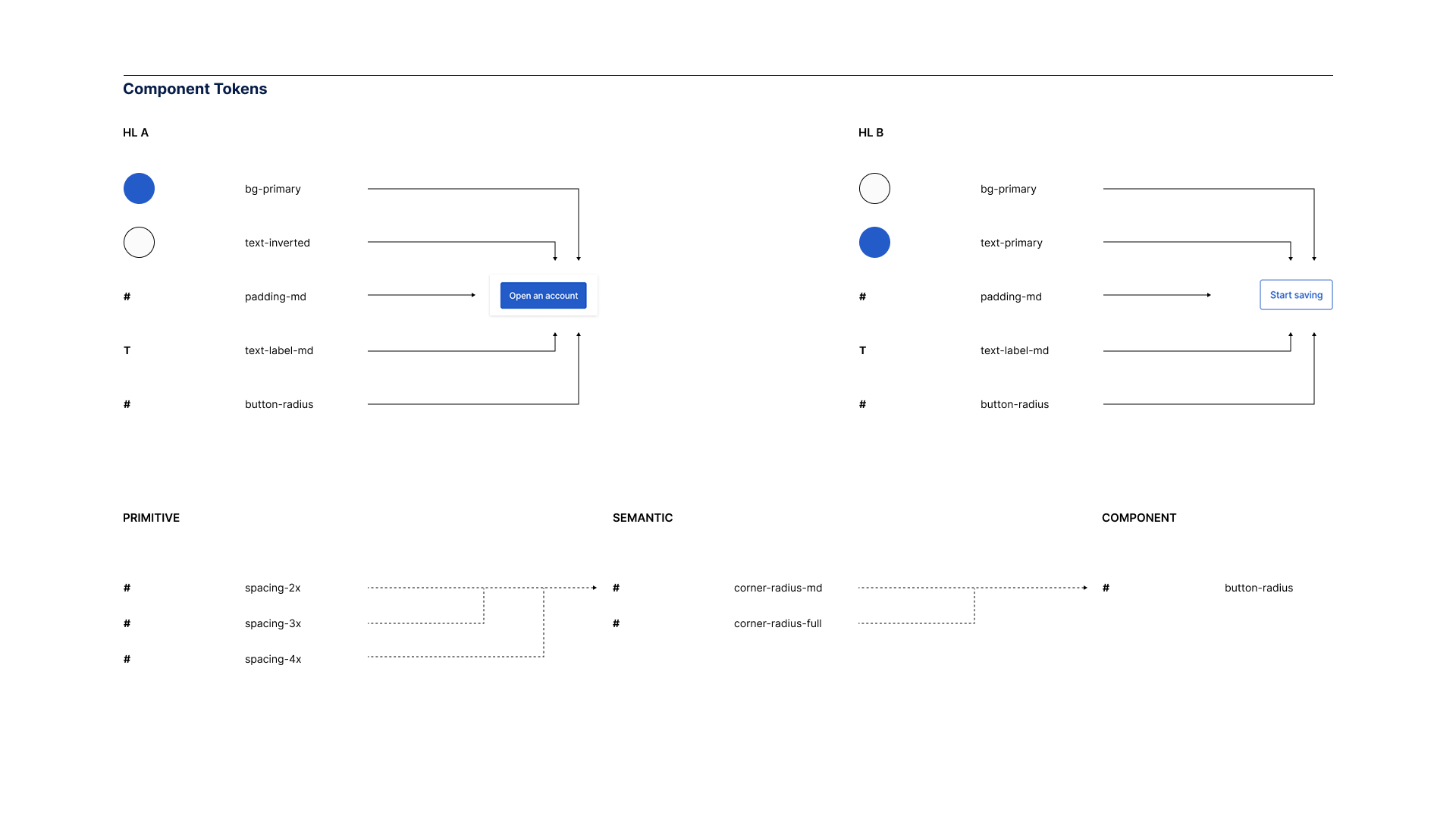
Component tokens answer: what makes this element different across brands? A button's corner radius. A card's shadow depth. These only become necessary when you're running multiple brands through the same library — but when you need them, they're the difference between a system that scales and one that forks.
What this looks like in production
Theory is one thing. Webflow shipped the proof.
When Webflow launched their Designer UI redesign, followed by user-selectable appearance themes — default, darker, brighter — they didn't rebuild their components three times. They swapped token values. Components referenced semantic names. Switching themes just worked.
The chain looks like this:
color: var(--colors-text-default);
↓
--colors-text-default: var(--core-colors-gray-400);
↓
--core-colors-gray-400: #C4C4C4;
Component references semantic token. Semantic references primitive. Change the primitive, and the entire UI updates in one pass. Webflow's team described this as "the dream" — update once, see the effects everywhere.
But they didn't start there. The codebase had years of hard-coded values — hex codes sitting directly on components, bespoke one-off designs that referenced nothing. Before the token system could work, they spent months unifying everything to consume the same CSS variables. Design tokens in Figma mapped to Less variables in one system and JavaScript objects in another. The unification work gave them a single source of truth.
They built tooling that traverses every pull request to catch hard-coded values. If it's not a token, it doesn't ship.
The architecture enables the flexibility. But only if you maintain it.
Tokens are how you make a design system machine-readable. The architecture is how you make it machine-trustworthy.
Why names matter more than values
Kholmatova observed that teams using metaphorical names for components got dramatically better adoption than those using descriptive names. "Minion" and "Boss" for small and large buttons — everyone remembered those. "Progress toggle button"? Nobody could remember what it was. When nobody remembers the name, they recreate the pattern instead of reusing it.
The same applies to tokens. text-default and background-subtle communicate role and intent. neutral-200 and primary-500 require you to remember what the numbers mean.The naming convention I use follows a two-axis grid. One axis defines the role — text, background, border, icon, surface. The other defines the variation — default, subtle, emphasis, inverse, disabled. The token name is the intersection: text-default. background-subtle. border-emphasis.Not every intersection gets a token. That's the point. You're designing the system by choosing which combinations matter. When the whole system fits on a single page, people use it. When it requires a manual, they work around it.
Modes, themes, and the multi-brand layer
Three terms that get used interchangeably and shouldn't.
A mode is a variation within the same brand. Light and dark. The token name stays the same; the resolved value shifts.
A collection groups tokens that share the same set of modes. Colour tokens might have light and dark. Typography might have desktop and mobile. Each collection manages its own.
A theme is a complete set of values for a different brand. Same structure, same names — different values.
Modes change values within a theme. Themes change values across brands. When someone says "theme" and means "dark mode," the conversation gets confused fast.
Component tokens become essential at the multi-brand layer. If you're only serving one brand, semantic tokens will carry you. But the moment a second brand arrives, you need a way to say "this button is a pill for Brand B but a rounded rectangle for Brand A" without forking the component. Both brands share the same semantic structure. Both use background-primary for the fill. But Brand A's button-radius points to radius-medium, and Brand B's points to radius-full. The component code doesn't change. Only the token values shift.
The discipline is restraint. Only promote a property to a component token when there's an actual difference to capture.
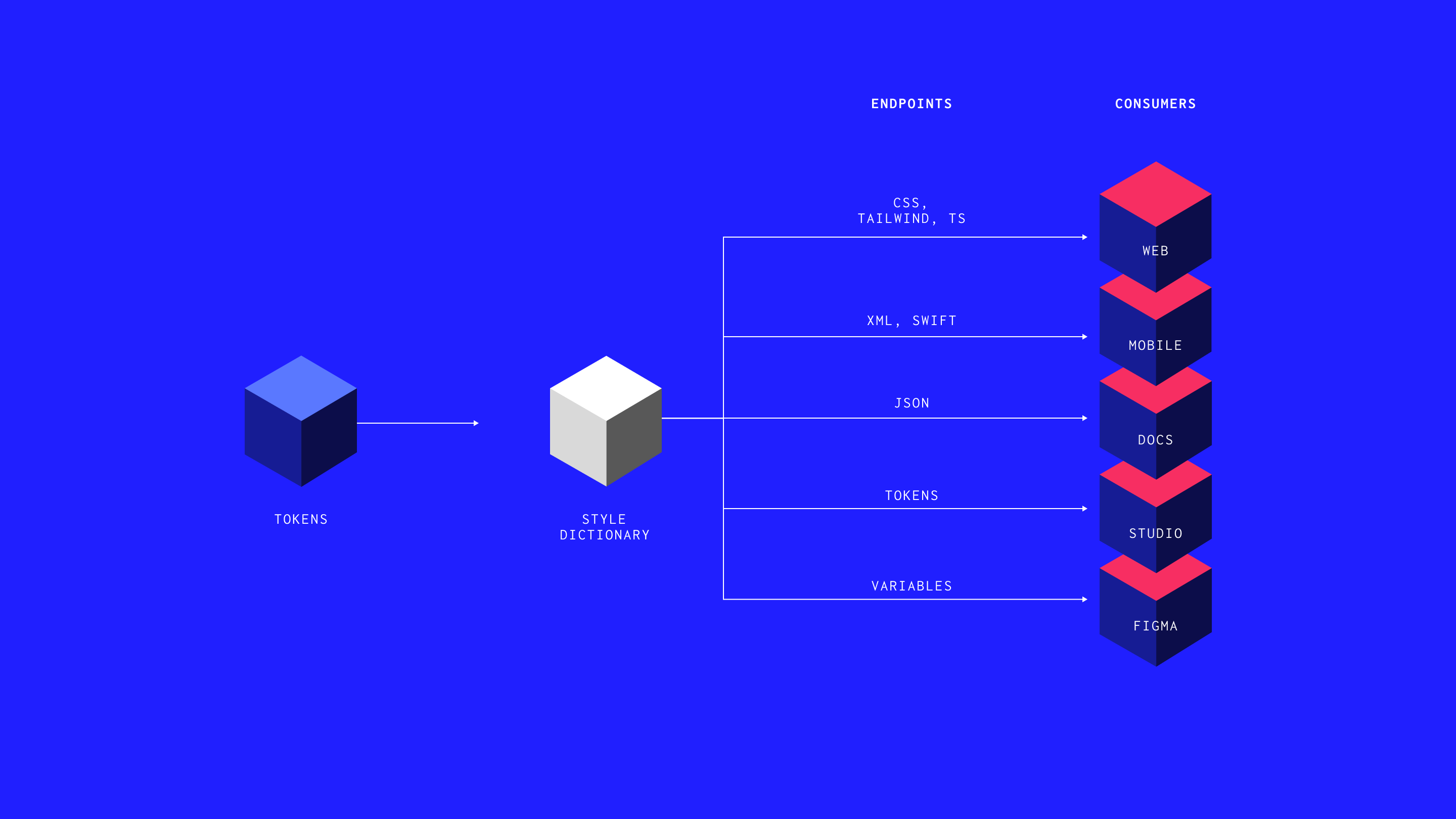
One source, multiple outputs
Tokens are typically stored as JSON. From that single source, a tool like Style Dictionary generates the outputs: CSS custom properties for the web, Swift for iOS, Kotlin for Android, synchronised Figma variables.
This is the hub-and-spoke model. Change a value in the JSON, run the build, every output updates. The alternative — separate definitions in Figma, CSS, and Swift — is how drift happens. One platform updates. The others don't.
One source. Multiple outputs. That's the architecture.
The system nobody remembers building
In The Timeless Way of Building, Christopher Alexander observed that the great cathedrals of Europe weren't designed by a single architect. They were built by groups who shared a deep knowledge of the patterns that made spaces work. Kholmatova applies this to digital products: a system works not when one person controls it, but when everyone has enough fluency to contribute coherently.
The Sipgate story from her book is worth remembering. They built a comprehensive pattern library. Every team contributed. A year later, duplicated patterns everywhere — because the library documented components without capturing the purpose behind them.
The architecture isn't the library. It isn't the Figma file. It's the decisions encoded in the layers between a raw value and a shipped component.
Where this is heading
Two things have changed that make token architecture essential rather than optional.
First, tooling has caught up. Figma variables, Tokens Studio, and Style Dictionary have made it possible to build a working system without a dedicated engineering team.
Second, AI extends whatever foundation you give it. Well-structured tokens with clear naming produce consistent output at scale. Loose primitives with social agreements amplify every inconsistency. Webflow's approach — tooling that blocks non-compliant values before they ship — points to where this goes next: systems that enforce themselves, where the architecture doesn't just enable consistency but prevents deviation. If a human has to check every implementation for compliance, the system hasn't finished its job.
Tokens are how you make a design system machine-readable. The architecture is how you make it machine-trustworthy.
Start here
Audit your primitives. Map every colour. Check for duplicates and accessibility issues. If you can't explain the logic of your scale, it's not a system yet.
Build a semantic layer. Start with the highest-frequency decisions — default text, default background, primary interactive colour, borders. Cover the twenty tokens that resolve eighty percent of your inconsistencies.
Draw the grid. Roles on one axis, variations on the other. The decisions you don't make are as important as the ones you do.
Connect the layers. Every semantic token references a primitive. Every component references a semantic token. If any value is hardcoded, it's a decision that hasn't been captured yet.
Set up the pipeline. Even a basic JSON → Style Dictionary → CSS setup is better than nothing. Once tokens are in code, they're version-controlled and distributable. Once they're only in Figma, they're a suggestion.The palette is the beginning. The architecture is the system.
ARTICLES
Further Reading


All flow.
No friction.
hamish@hux.works
+44 (0)7832 839 543
