VERSION:
v0.1
CLIENT
DEEP
SURFACE:
hux.works
/project/deep
SUBJECT:
Case study
AUTHOR AND DATE:
HAMISH DUNCAN
09.05.26
DEEP
A design infrastructure for making humans aquatic
Design System
Overview
Challenge
This wasn't a branding problem. It was a credibility problem. Partners and investors were being asked to trust DEEP with high-stakes engineering in extreme environments. The fragmented visual landscape was undermining that trust before any conversation started.
Goal
Discovery
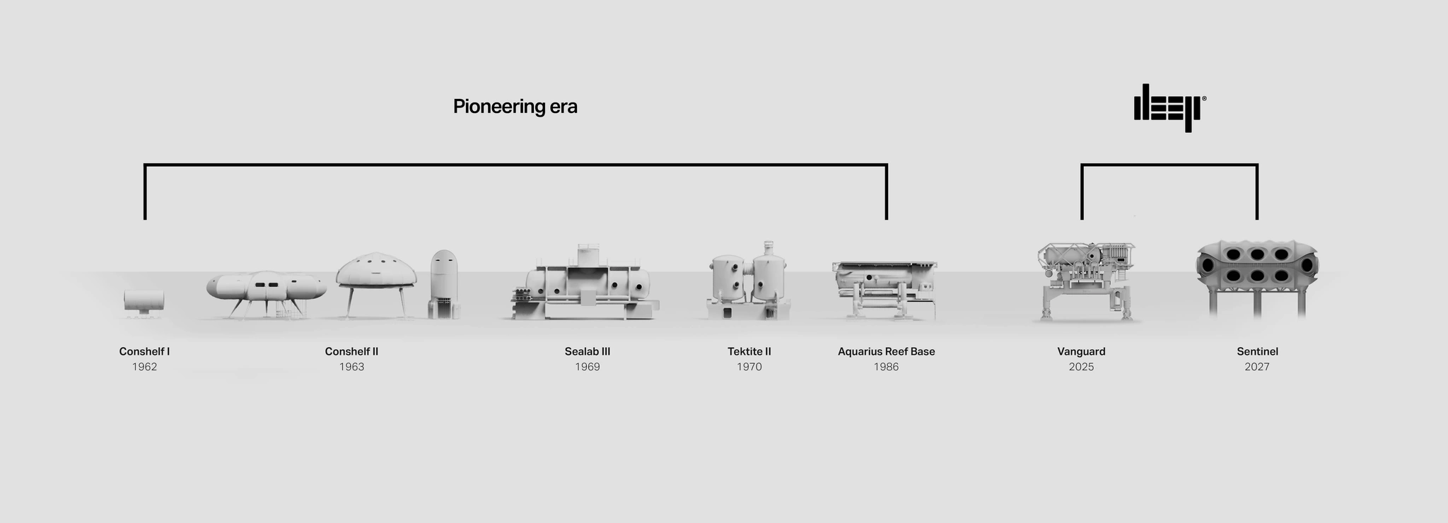
Audited the full scope of DEEP's output: submarines, habitats, expedition logistics, campus facilities, investor materials, technical dive operations. Documented twelve distinct visual approaches across active materials—what Gemini accurately called "design debt."
The inconsistency had cost them. A potential partner had questioned whether DEEP was "one company or several." An investor had asked why the pitch deck didn't match the website. These weren't design critiques—they were trust signals.
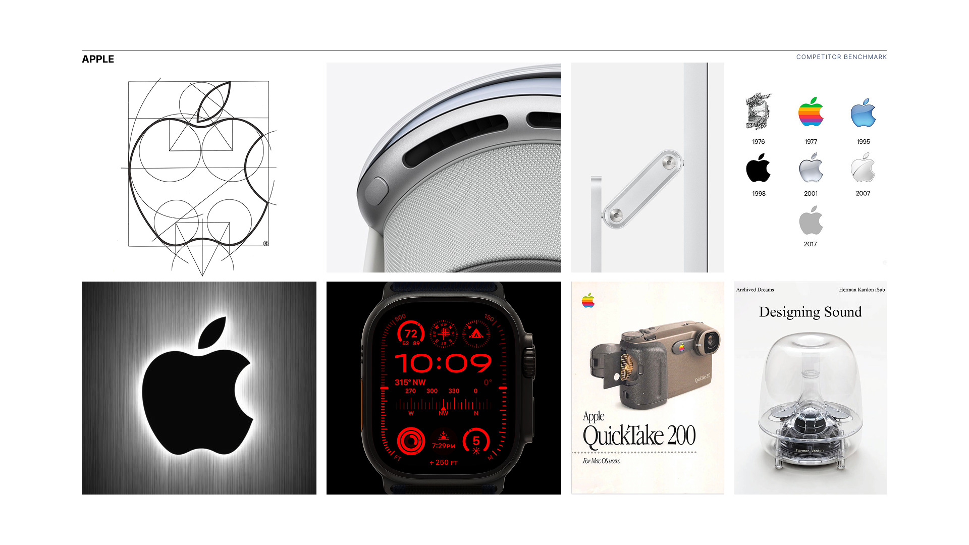
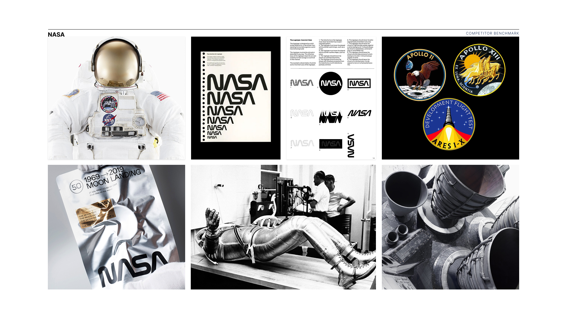
Benchmarked against NASA, ESA, and Woods Hole Oceanographic. The question wasn't "what looks good?" but "what reads as credible at institutional scale?"
Strategy
Defined a system architecture with a clear hierarchy: core identity locked, application layer adaptable.Two directions were rejected early:
1. Sci-Fi aesthetic — Undermined engineering credibility. Made DEEP look like a concept, not a company building real infrastructure.
2. Generic corporate — Lost the audacity. DEEP is attempting to make humans aquatic. The brand needed to carry that weight without looking like a consultancy.
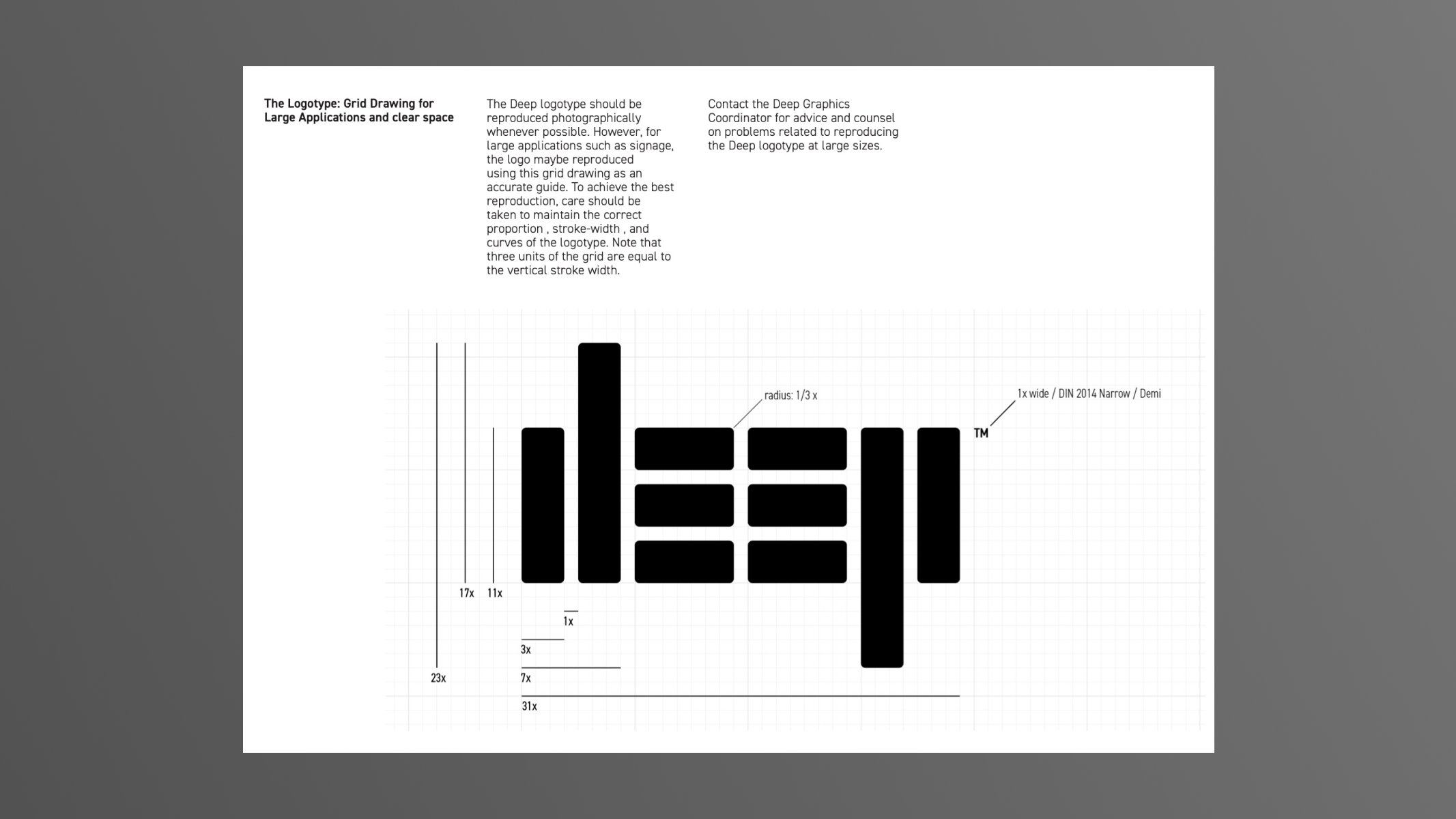
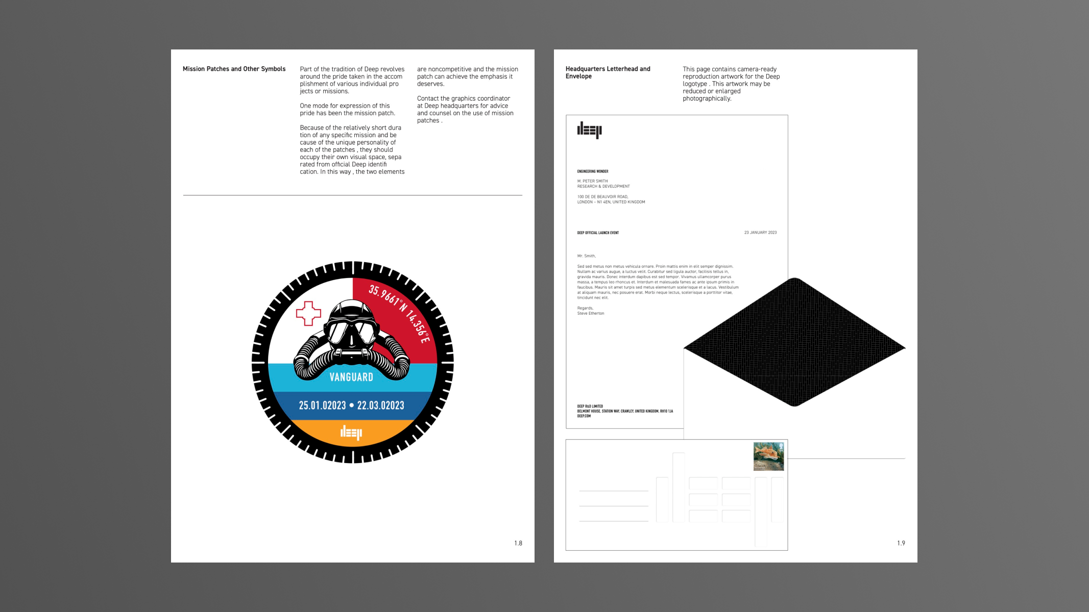
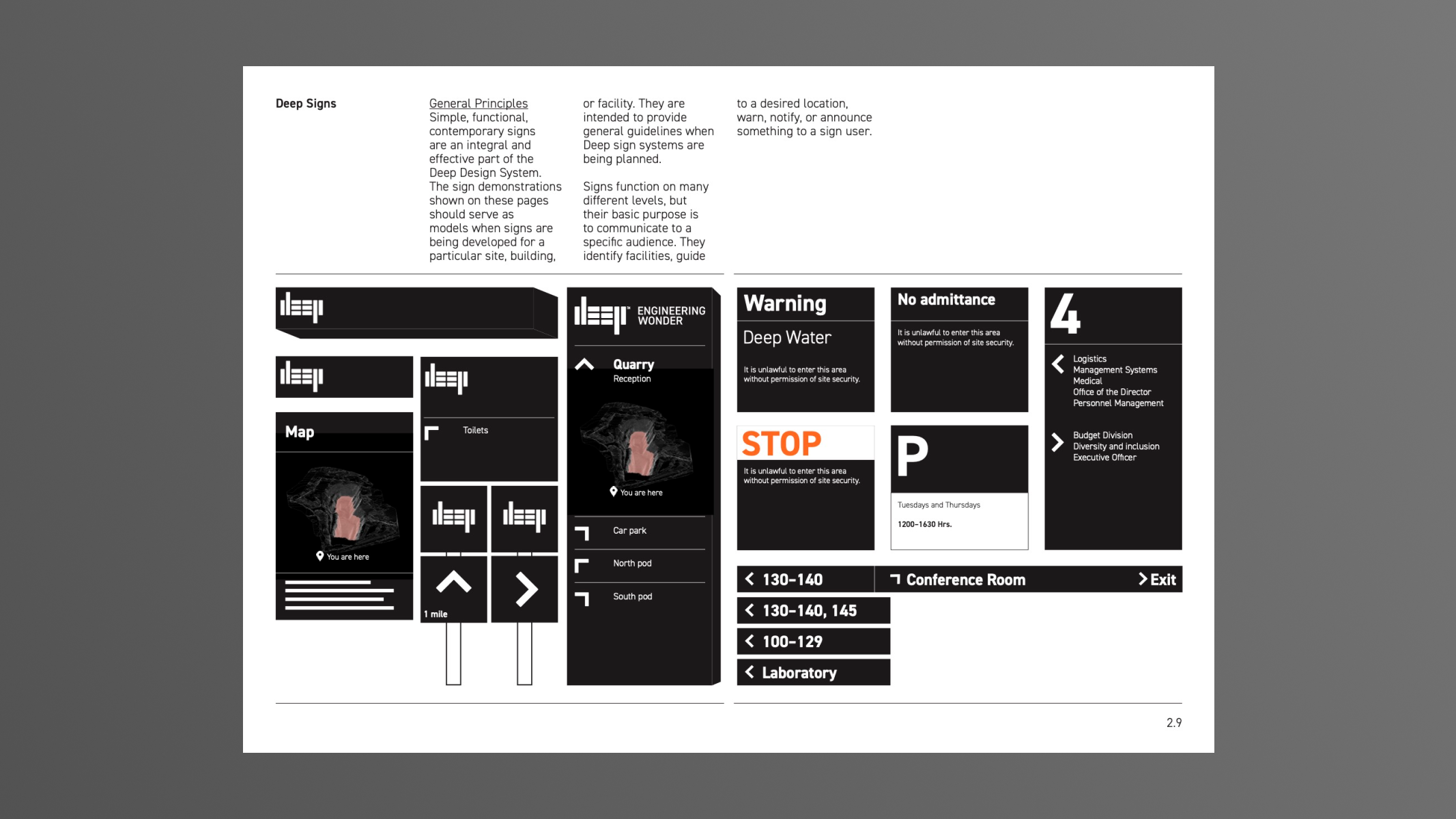
The position we landed on: functional institutionalism. Trust and ambition in tension. Serious enough for engineering partners, bold enough for the mission.Developed an internal dive sign alphabet for technical teams. Operational communication needed the same rigour as brand communication. If the system couldn't function 40 metres underwater in low-visibility conditions, it wasn't finished.
Prototyping
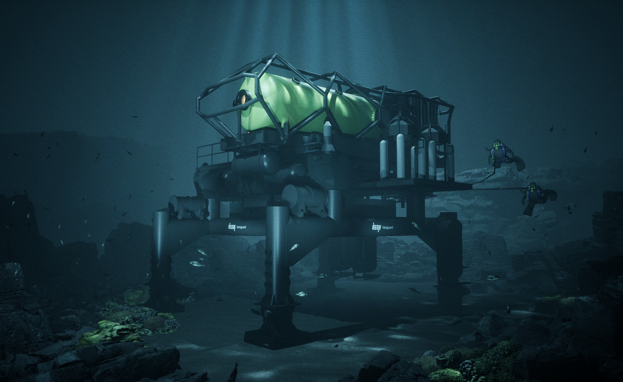
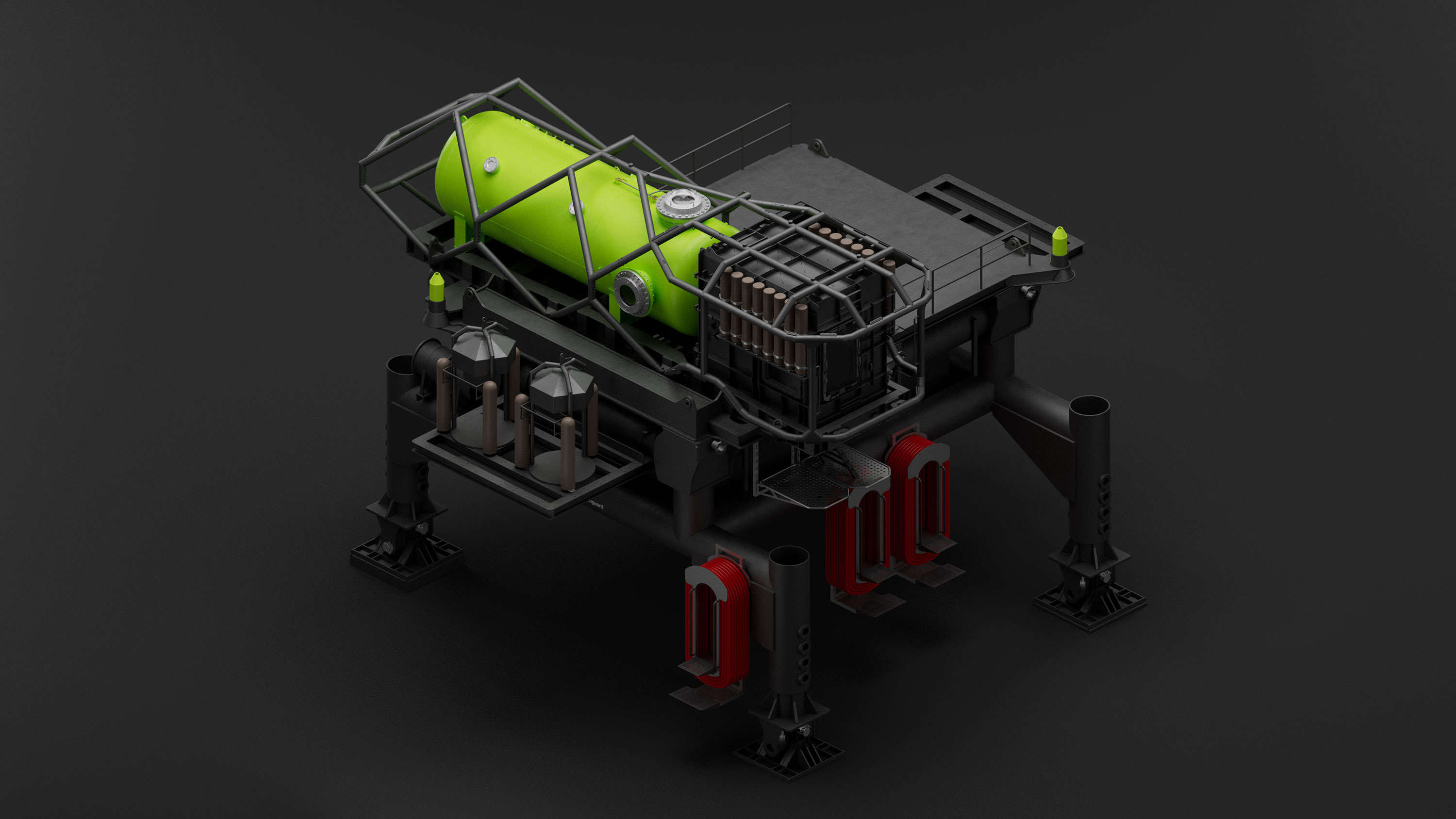
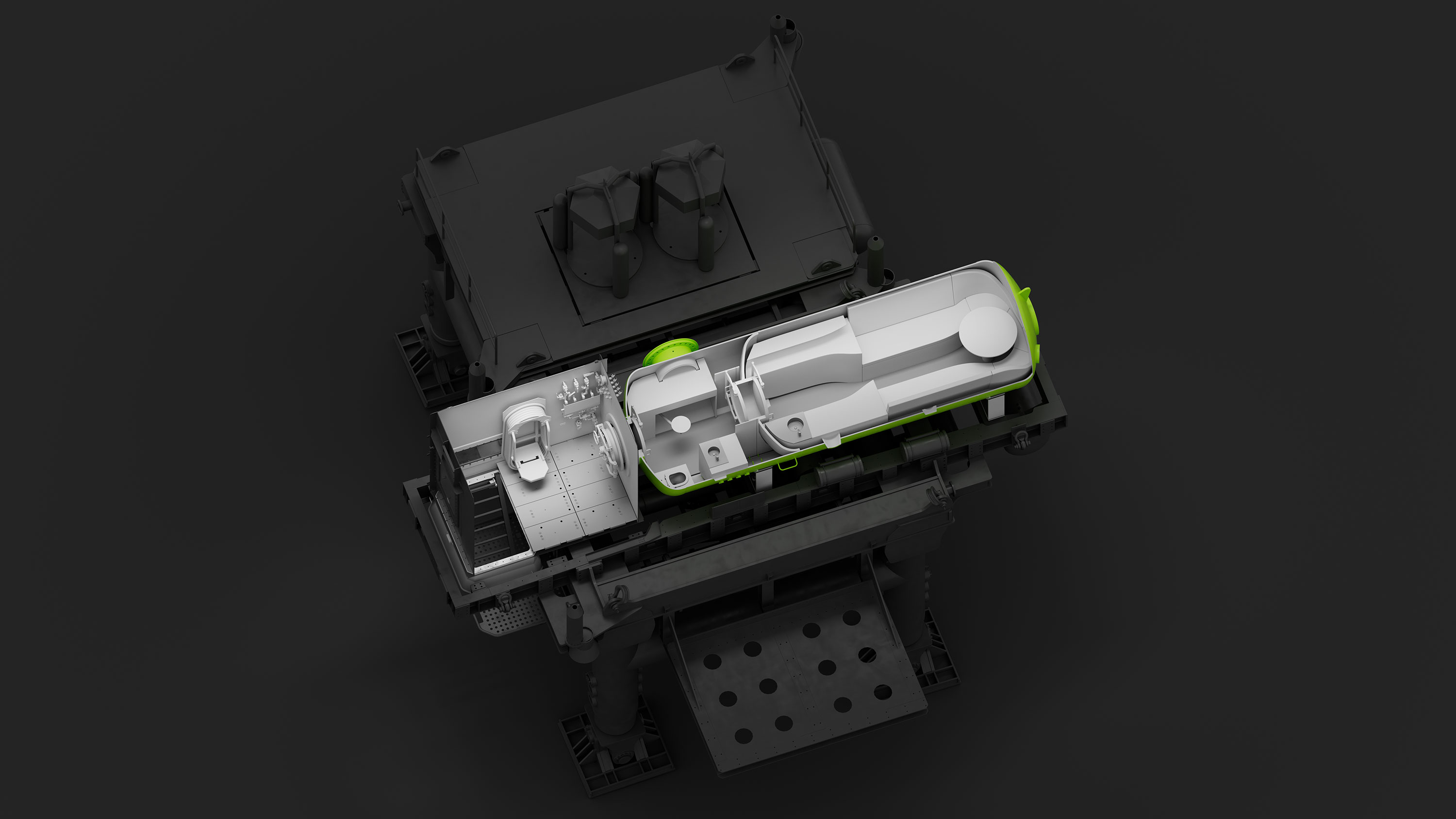
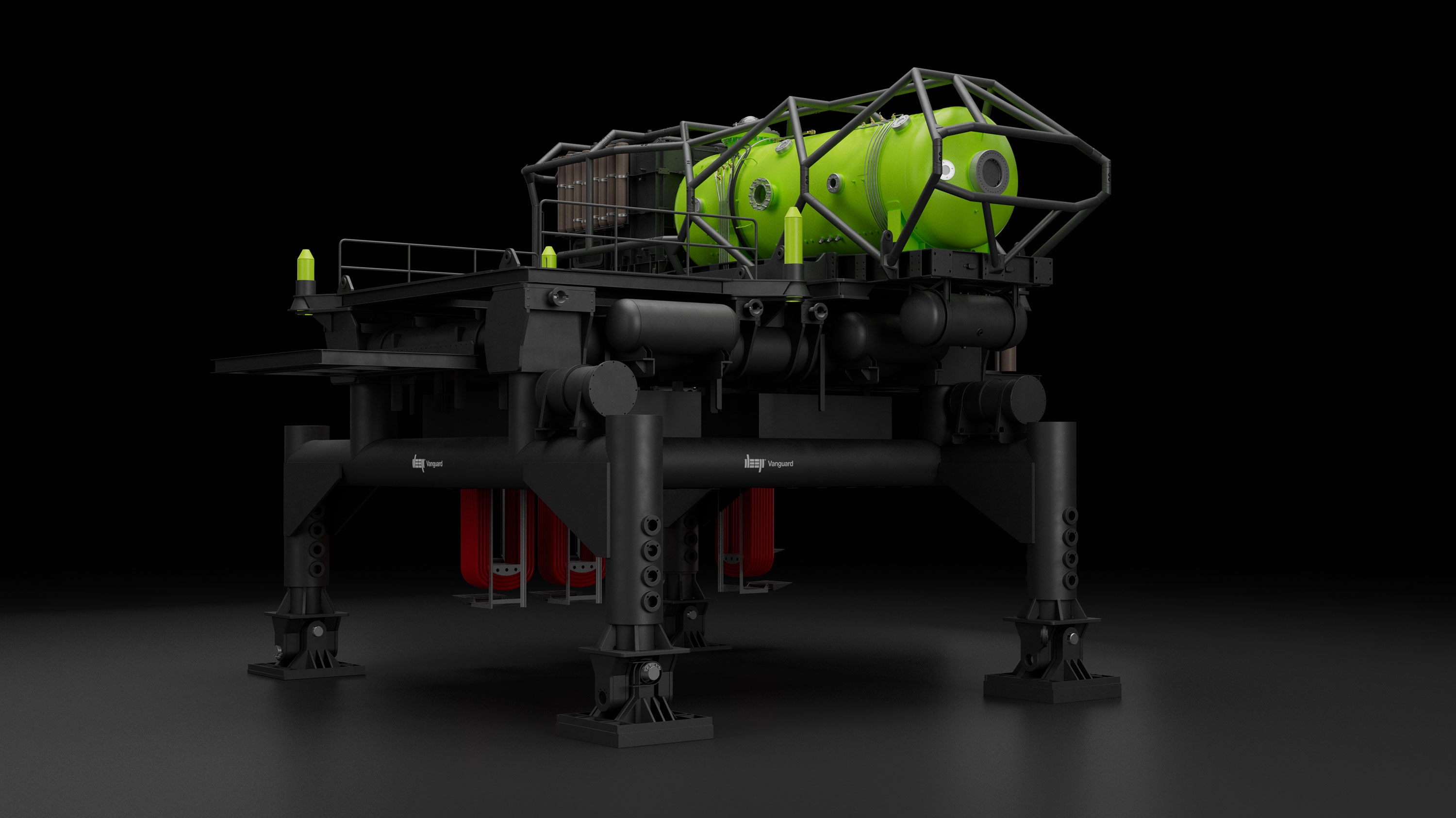
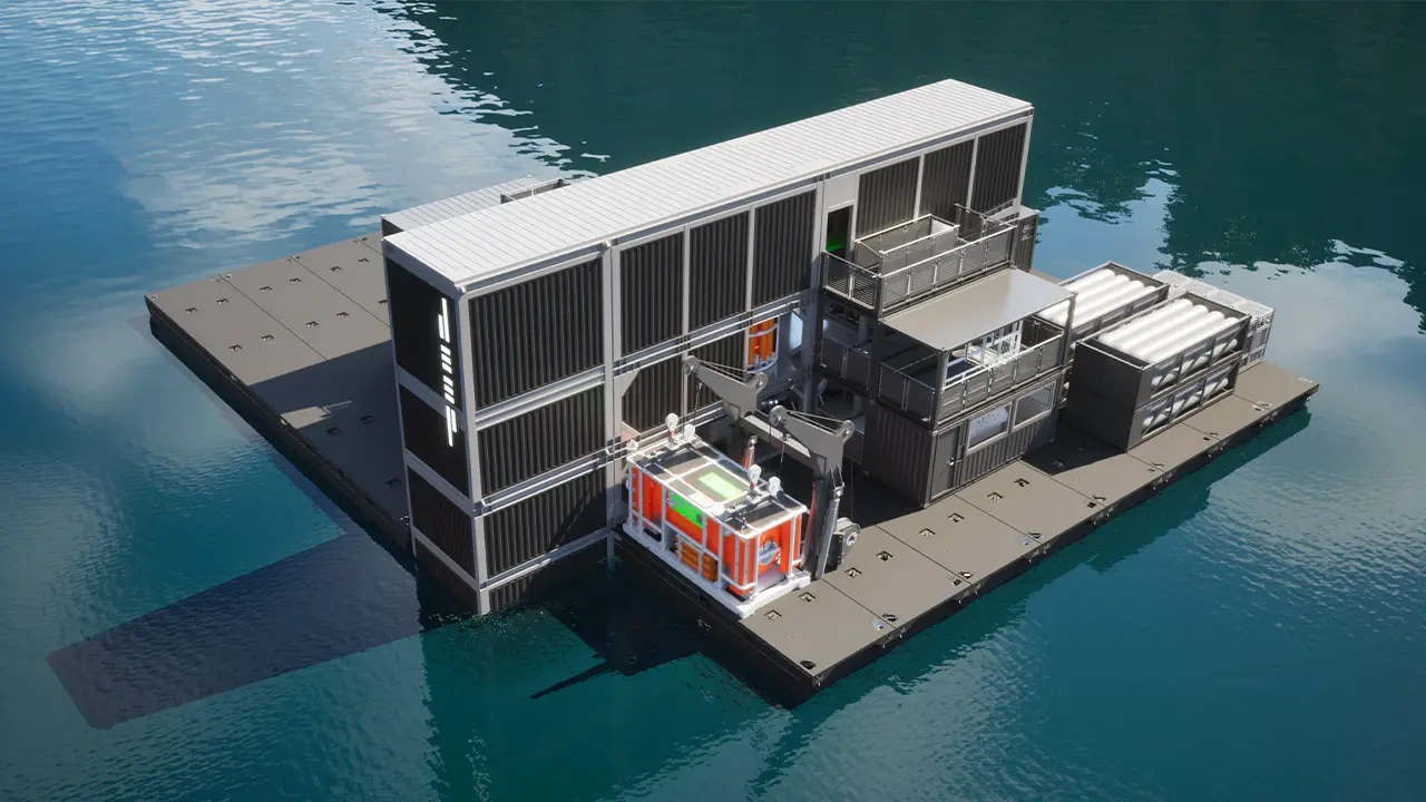
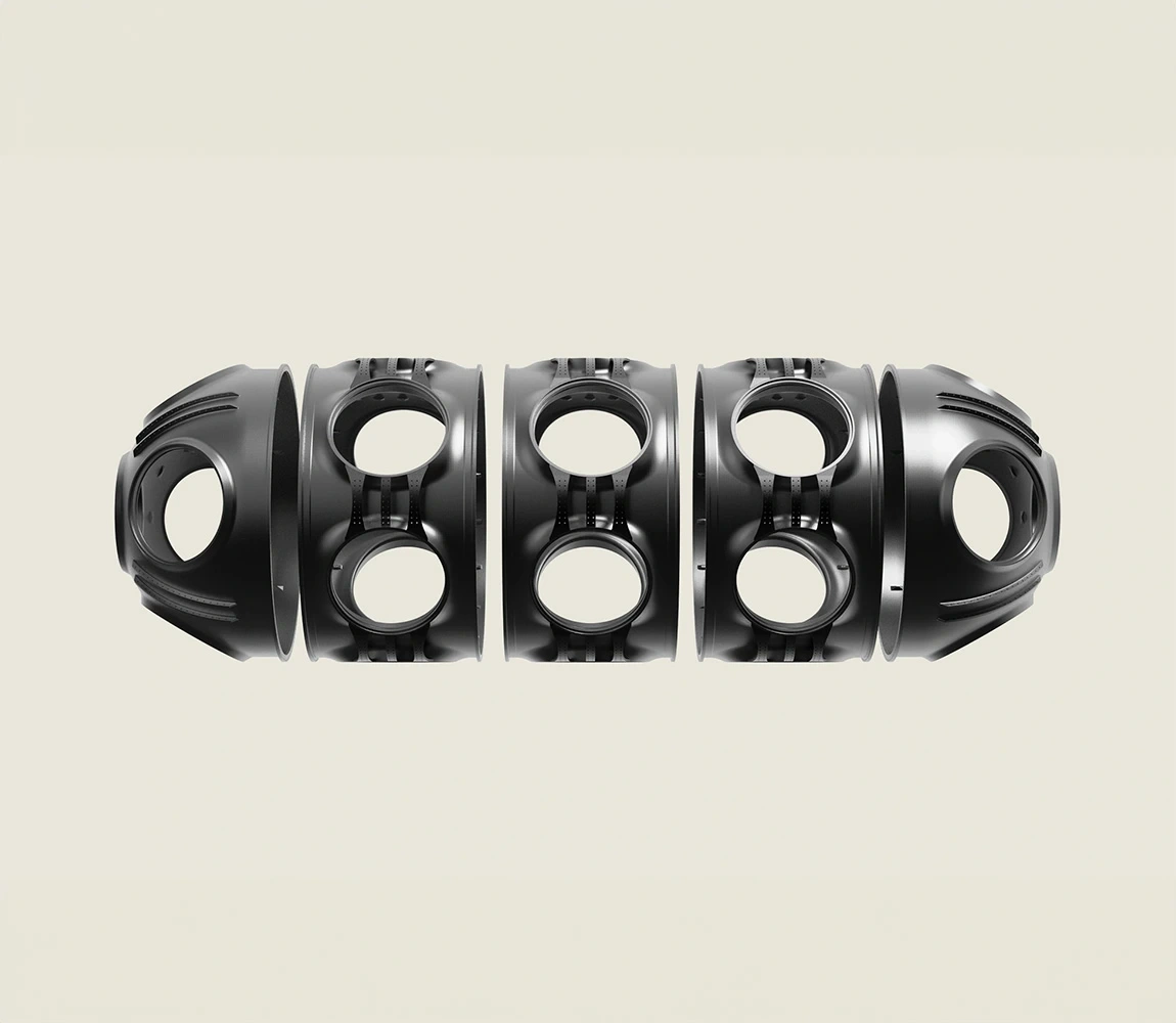
Built applications across priority touchpoints: Vanguard habitat livery, expedition maps, campus wayfinding, sustainability materials, investor deck, technical documentation.
Tested each against a simple question: does this hold up next to NASA?
Ran stress tests—same identity applied to a mission patch, a submarine hull, a pitch deck, a safety manual. The system needed to flex without breaking. Refined until it did.
Implementation
Delivered complete design system: UX/UI, 3D animation, uniforms, liveries, communications templates, operational frameworks, campus architecture guidelines.
More importantly, delivered documentation architecture that allows internal teams to extend the system autonomously. The goal was never to create dependency—it was to install capability.
First product (Vanguard habitat) now live. The system enabled DEEP to operate at institutional scale from day one—dive operations, investor pitches, physical infrastructure—without design debt or brand drift.
Results
Senior team members across engineering, operations, and commercial now work from a shared system. Individual advocacy sessions ensured each leader understood the logic—not just the assets. Templates and artefacts are used correctly from source, not reinvented per project.
Product launches, dive expeditions and regulatory submissions all pull from the same foundation. Maps, patches, PDF materials for local authorities, maritime institutions and regulators are produced in hours, not weeks. No rebuilding from scratch. No drift between teams.
The system now covers campus signage, the Bristol manufacturing hub, submarine and habitat liveries, machinery, samples, uniforms, accessories, technical manuals, expedition materials and investor communications. Every surface speaks the same language.
DEEP operates at institutional scale with startup speed. Unified message, unified look, professional delivery across every touchpoint—systematically, not heroically.


.webp)
.webp)
ARTICLES
Further Reading
View all

All flow.
No friction.
hamish@hux.works
+44 (0)7832 839 543
