VERSION:
v0.1
CLIENT
Hargreaves Lansdown
SURFACE:
hux.works
/project/hargreaves-lansdown
SUBJECT:
Case study
AUTHOR AND DATE:
HAMISH DUNCAN
09.05.26
Hargreaves Landsown
Get Active
Design System
Overview
Challenge
The problem wasn't talent or intent. Every team was capable. But without a unifying system there was no scalable way to address consistency, accessibility or efficiency. The rebrand made the cost of that gap visible to everyone.
Goal
Discovery
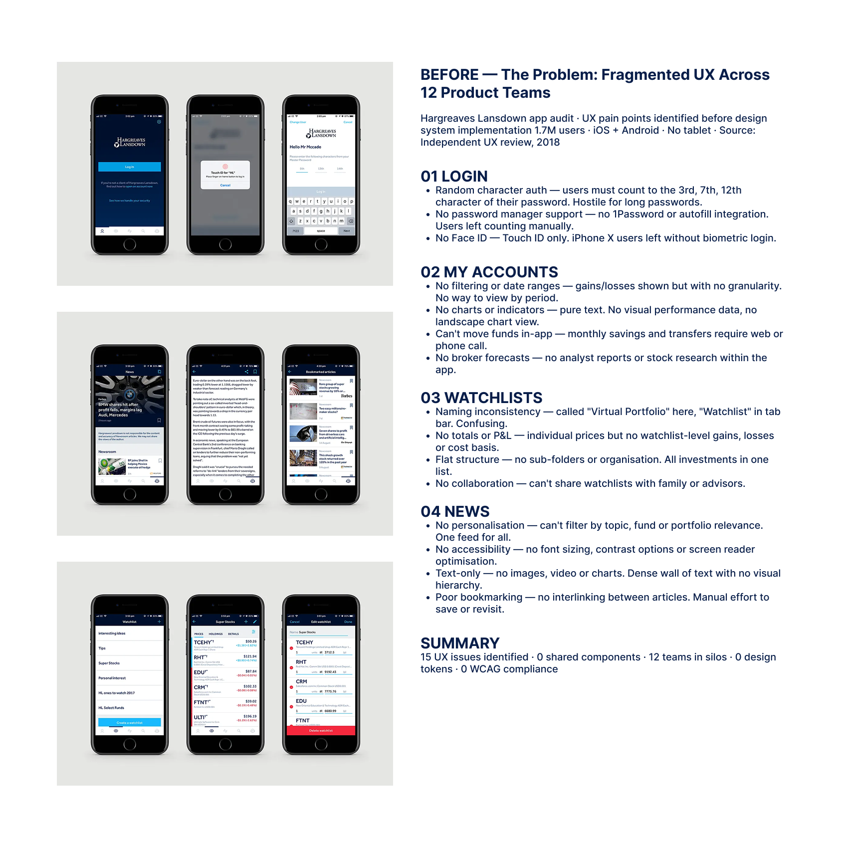
Audited existing component libraries, coded UI patterns and accessibility reports across web, mobile and native apps. The landscape was fragmented: overlapping components with subtle inconsistencies, spacing and typography that varied by team, accessibility handled as remediation rather than foundation.
Paired the audit with conversations across product, design and engineering to understand where friction showed up day to day. The findings were consistent—teams wanted a shared system they could trust. They didn't want to maintain their own variations. They'd built them because nothing authoritative existed.
Strategy
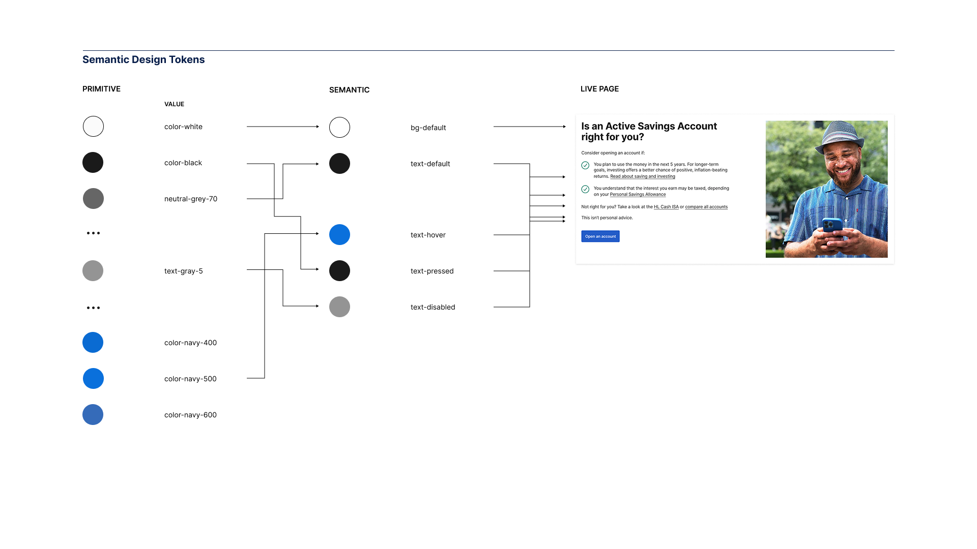
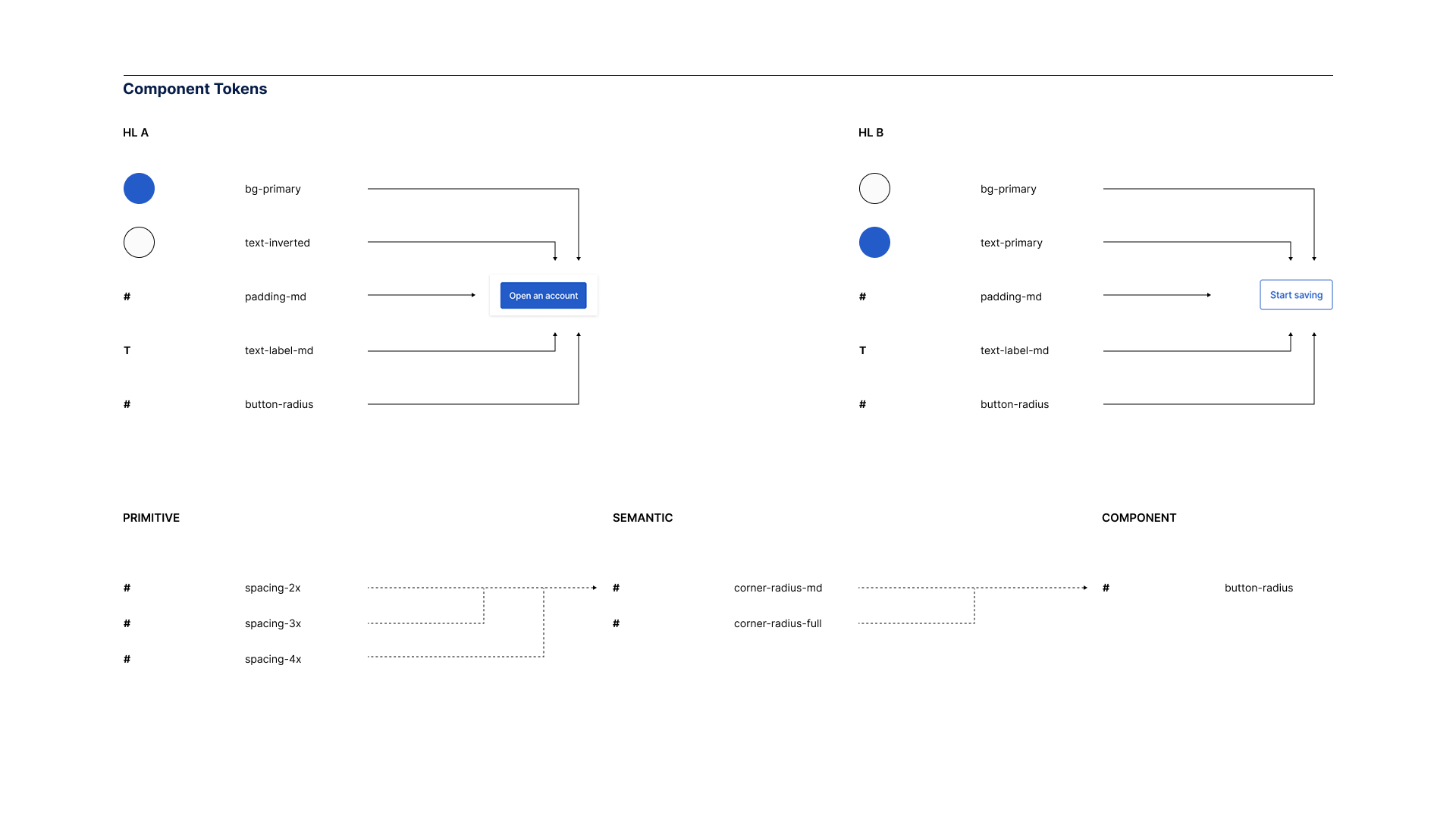
The system was positioned as infrastructure, not a component library. Tokens first, components second. Accessibility and performance as foundations, not additions.
Critically, the system was framed as a service to product teams rather than a top-down mandate. The pitch was practical: faster delivery, fewer regressions, less cognitive load. I worked with leads across disciplines to align the system with existing product roadmaps—adoption would follow value, not enforcement.
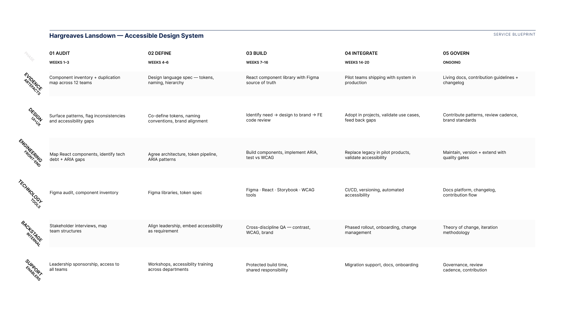
Defined a governance model that balanced central ownership with team contribution. The system needed to be authoritative without being rigid. Teams could extend it, but extensions followed shared conventions.
Prototyping
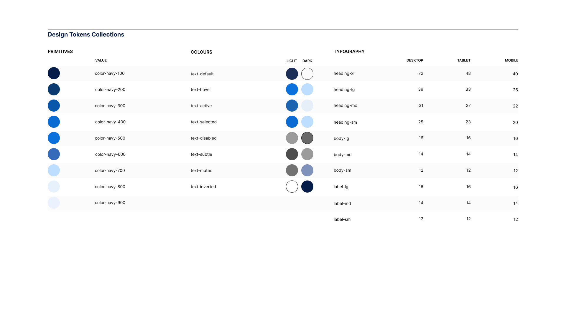
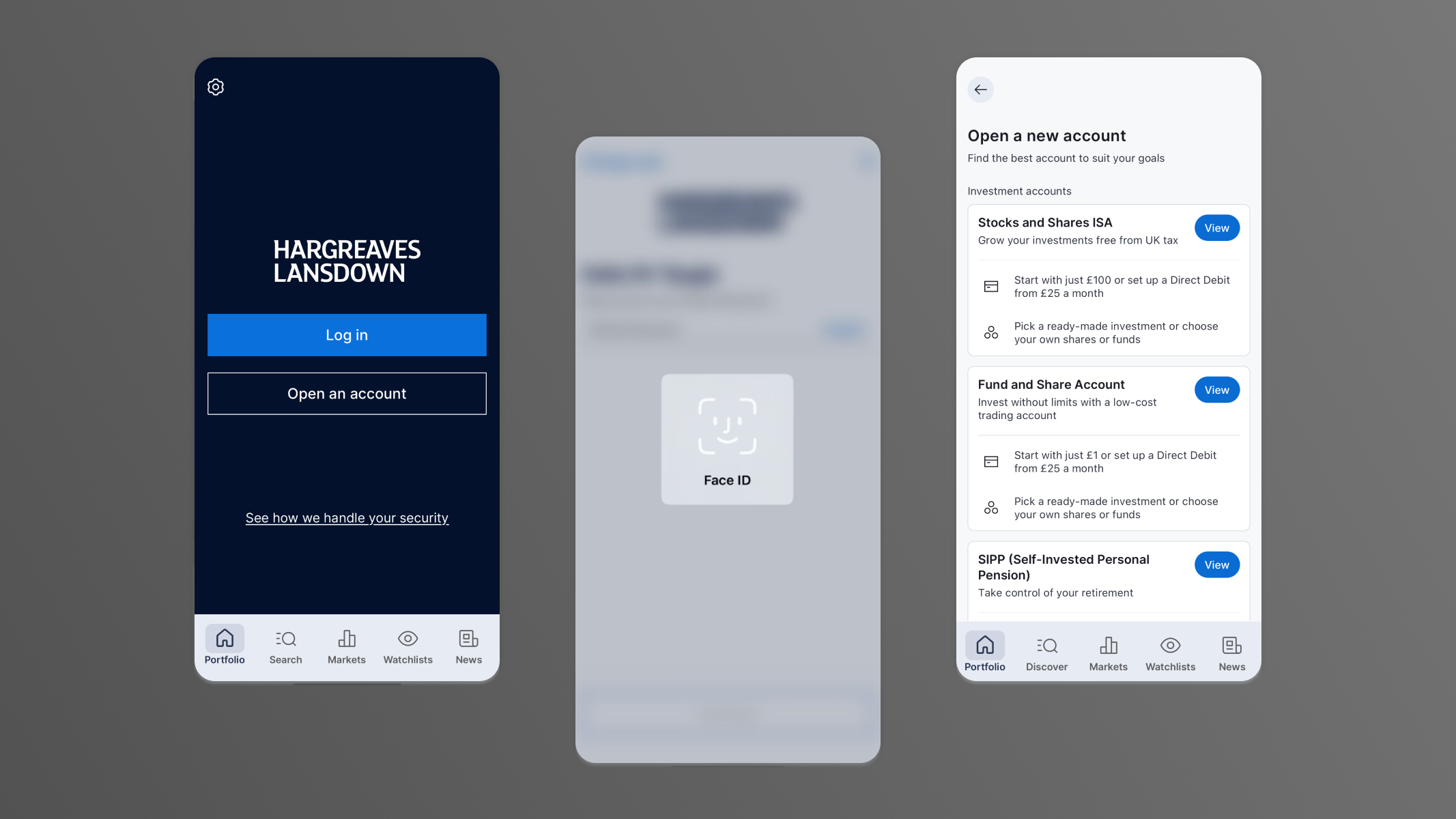
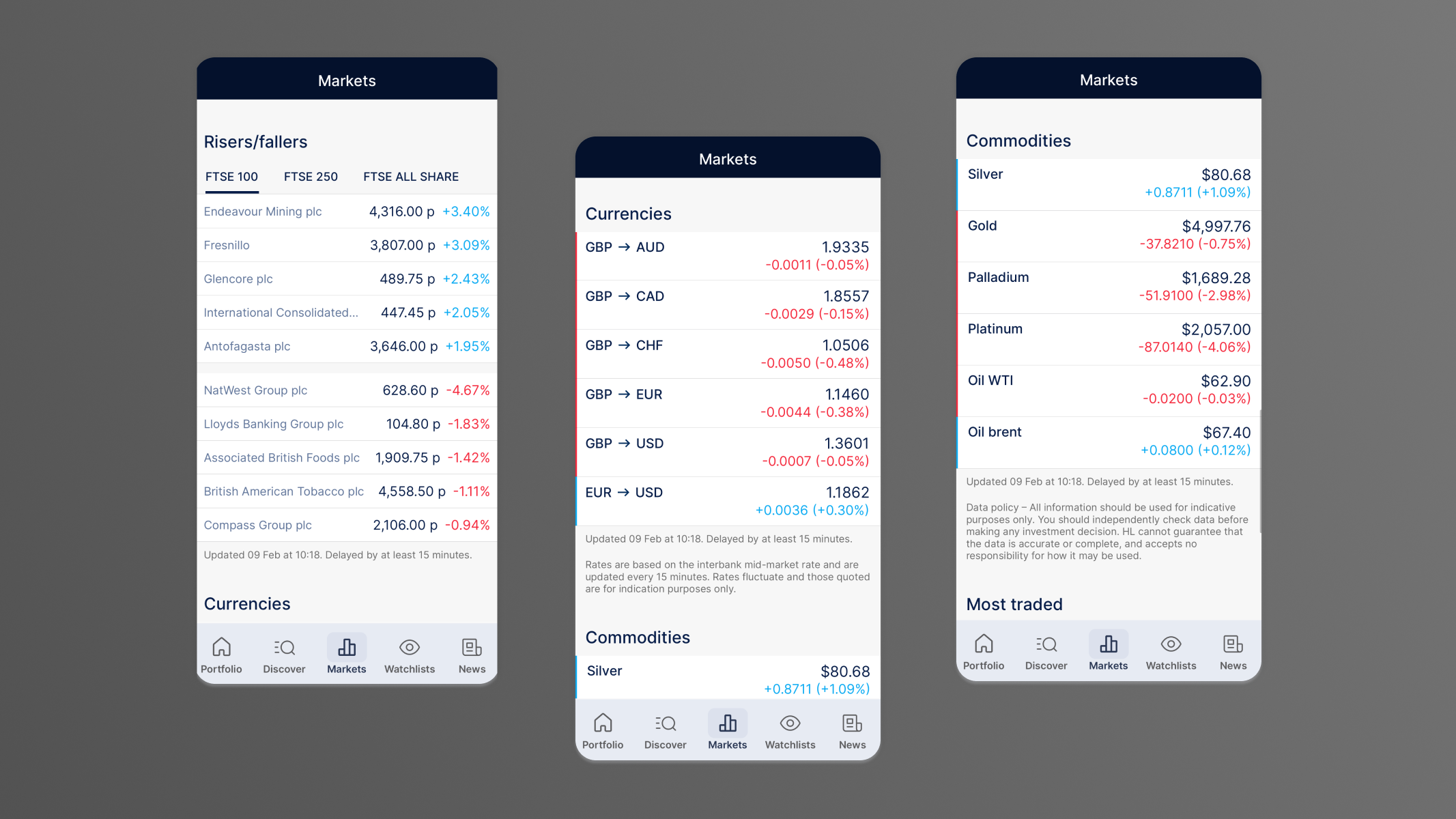
Rebuilt core primitives in Figma using tokenised colour, type and spacing, then mapped these directly to coded equivalents in React and Storybook. High-use components were prioritised and tested in real product contexts rather than abstract demos.
Worked in rapid feedback loops with front-end engineers. Where designs didn't translate cleanly, patterns were adjusted. This phase proved out naming conventions, component APIs and documentation style before broader rollout. By the time the system shipped, the friction points had already been found and resolved.
Implementation
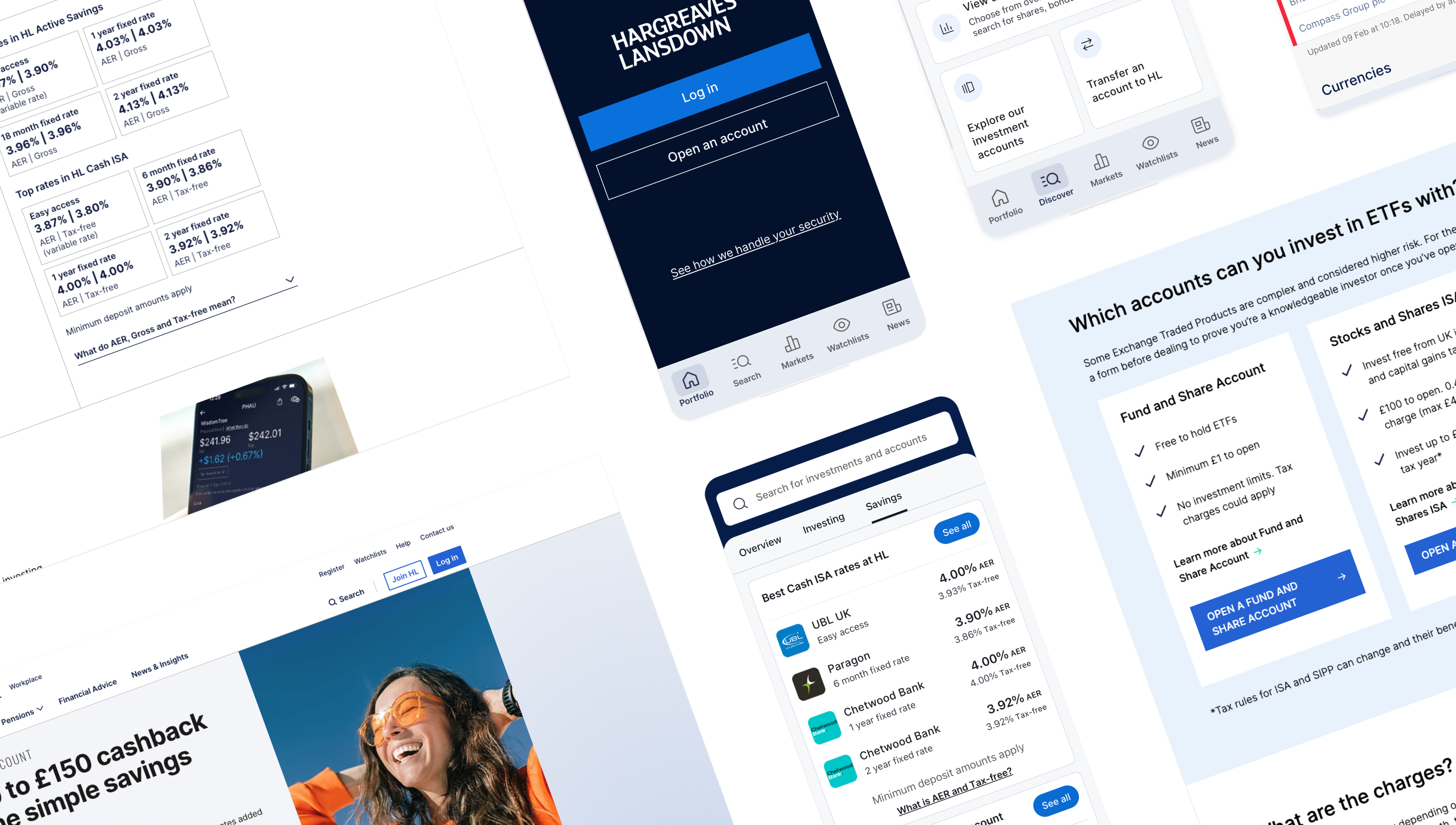
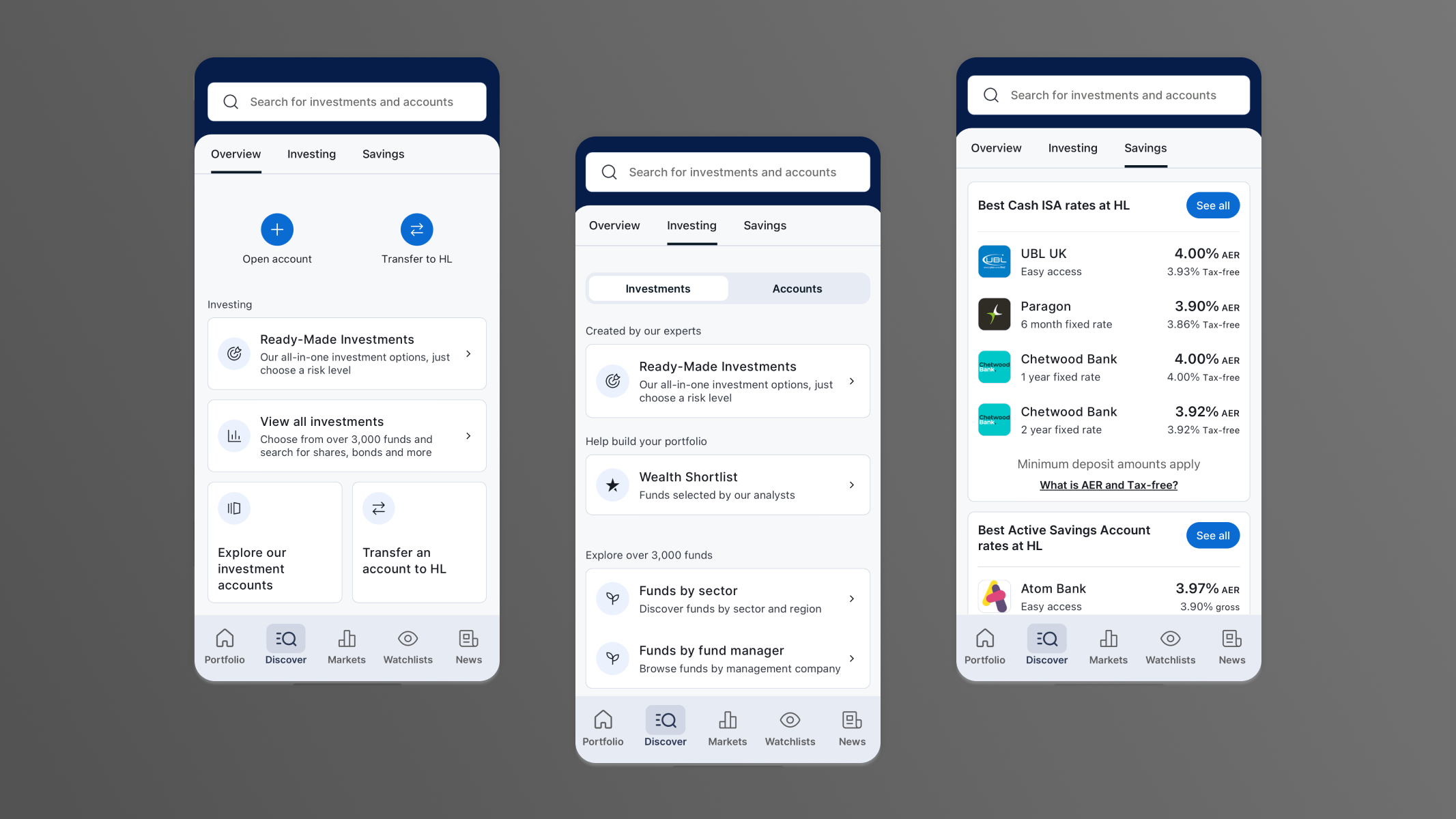
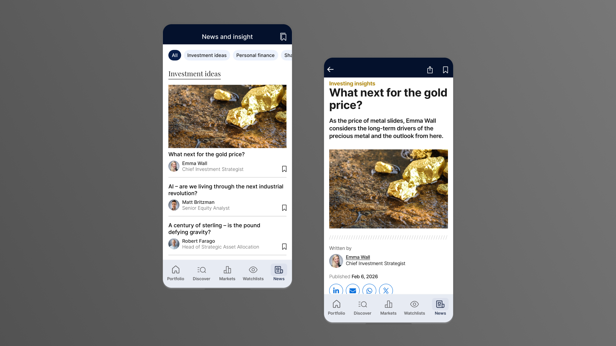
The system shipped as a unified Figma library paired with a coded component library, with parity maintained through shared tokens and semantic versioning. Every core component was built to WCAG 2.1 AA standards—accessibility handled at system level, not checked project by project.
Wrote documentation covering usage, accessibility requirements and contribution paths. Reduced reliance on tribal knowledge. Supported adoption through onboarding sessions, office hours and direct collaboration with product teams during integration.
Results
The design system consolidated multiple fragmented libraries into a single shared platform adopted across product teams. Where teams had previously maintained their own component variations—often duplicating the same patterns with subtle inconsistencies—the system introduced one authoritative Figma library and one coded component library, kept in sync through shared tokens and versioning.
The practical impact was felt across the design-to-engineering workflow. Handover shifted from annotated static screens to documented, tokenised components with clear usage guidelines and accessibility requirements built in. Engineers spent less time interpreting design intent. Designers spent less time recreating solved patterns. Both spent more time on product-level problems.
Accessibility moved from reactive remediation to structural default. Every core component met WCAG 2.1 AA standards. Teams could trust that compliance was handled at the system level rather than audited project by project.
The system serves 1.7 million users across web, mobile and native apps—not as a finished product, but as living infrastructure that teams adopt incrementally, contribute to, and trust to hold as the platform scales.
ARTICLES
Further Reading
View all
All flow.
No friction.
hamish@hux.works
+44 (0)7832 839 543
